print voucher
SK Chase provided me with some samples of potential concepts that seemed to fit their needs. I also spent some time looking at various user journeys for e-voucher redemptions online, focusing on information presentation and user interaction. While this provided a good jumping off point to start thinking about the core issue of balancing aesthetics and clarity of information, it also highlighted the fact that a bespoke solution would be needed to really tackle these core issues and elevate the user experience.
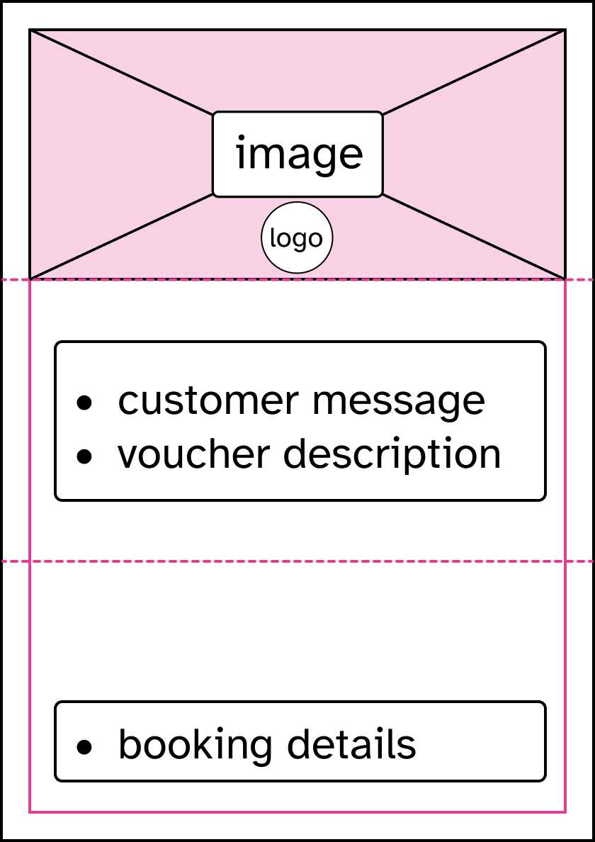
The general anatomy of the template needed to accommodate 3 things:
- Decorative image (except for ink-saving version) and hotel logo
- Voucher content & personal message
- Booking information
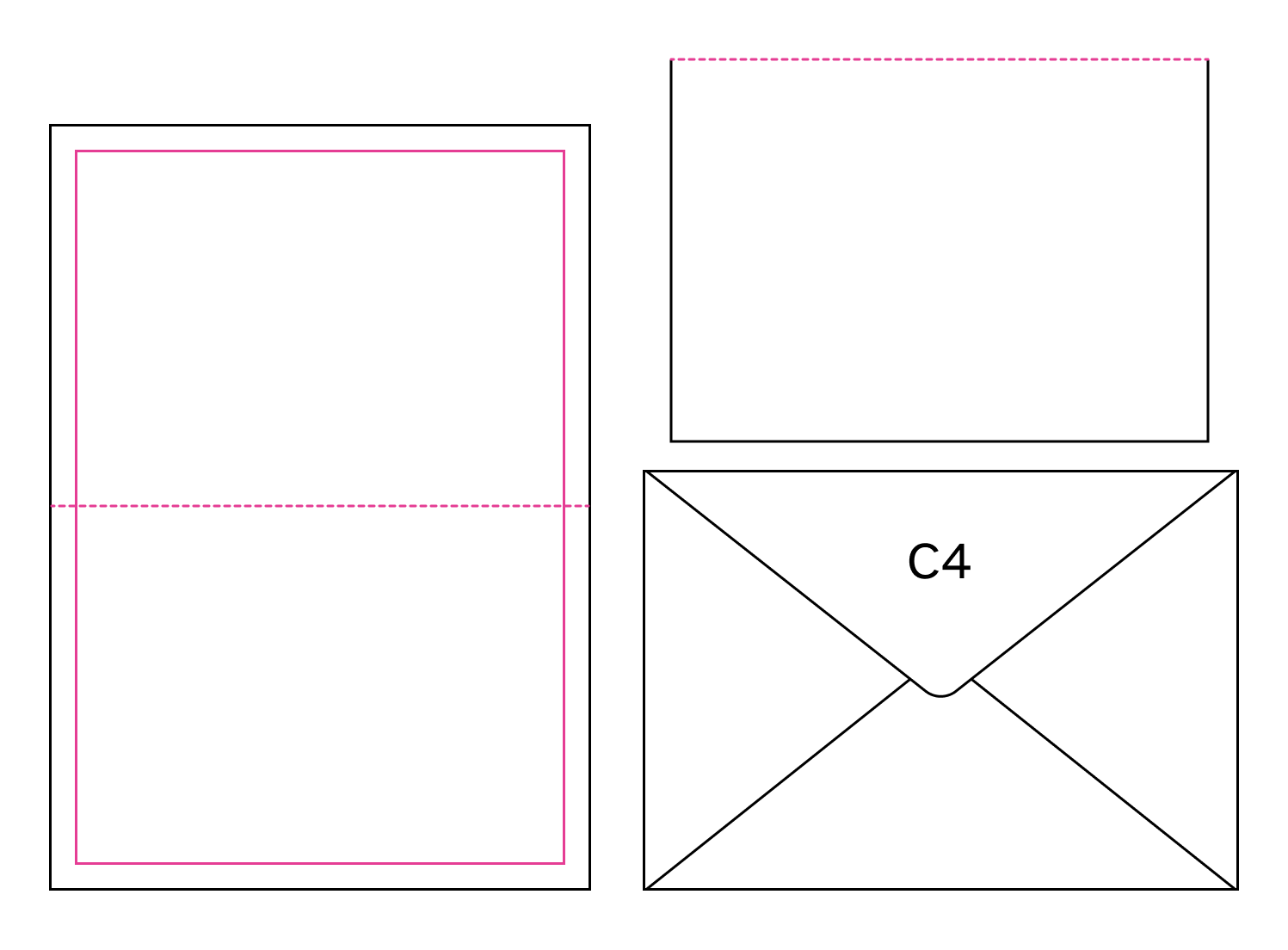
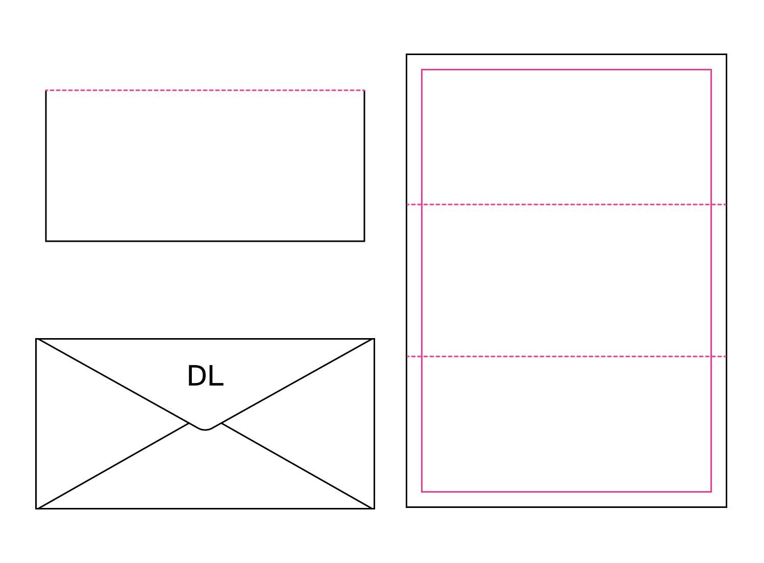
I mapped out overlays of ½ and ⅓ folds while designing the layout of the page to ensure the folds don’t overlap content fields. These dimensions, when folded, fit standard-sized envelopes.
This can only be done approximately due to the variable lengths of the text fields and their ability to expand, but the folds still lie in the white space between fields for the majority of use cases, allowing the vouchers to be folded and still look attractive when opened back up.
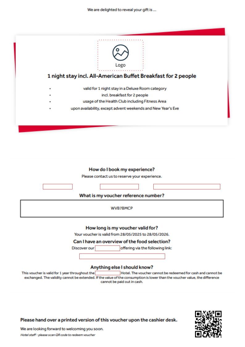
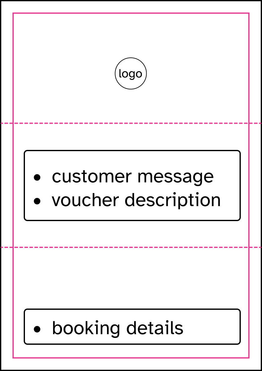
The old design evenly distributes all of the booking information across the page, which is possible as it doesn’t feature an image. My idea was to make a design with a large image possible by condensing and organising all the booking information into a much smaller space, and utilising that space more efficiently.
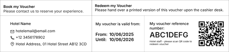
^ My first priority was drafting the booking information fields. I blocked out the necessary number of fields for the maximum amount of info, grouping fields by similarity.
Feedback round: bottom component >
“a bit too industrial/utilitarian for our more traditional clients”
“we can lose the long, natural wording of section headers and shorten them”
I used PenPot flex boards to create the layout. This allowed me to mock up the concept using CSS flex. I used this to simulate how information fields re-format when different fields were hidden (opted out of by hotel clients), to mimic the behaviour of the final template. My aim was to account for all possibilities of hidden/visible fields so that the information bar would look aesthetically pleasing without any obvious blank spaces or overflow.
< flex elements in Penpot
^ 2nd iteration: I removed most vertical box outlines and lightened the remaining dividers. I shortened section headers, added an ‘address’ field and also added fine print at bottom of section, on request.
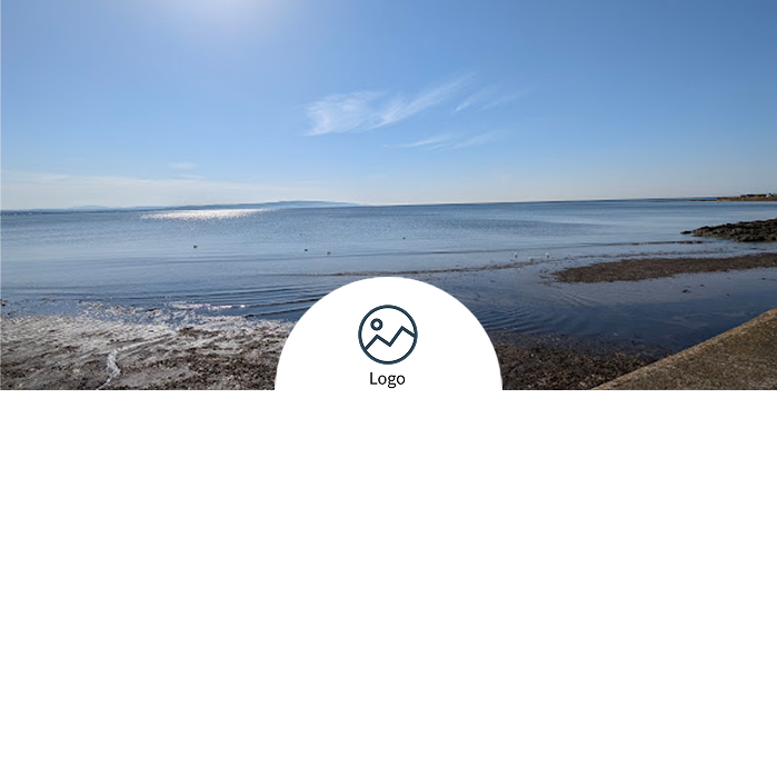
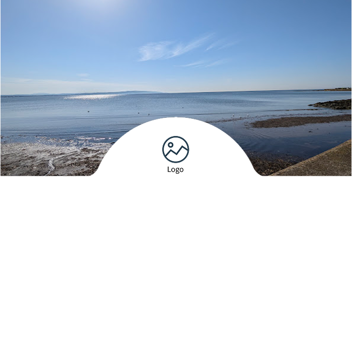
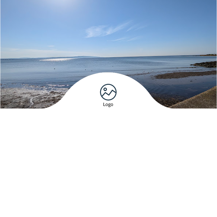
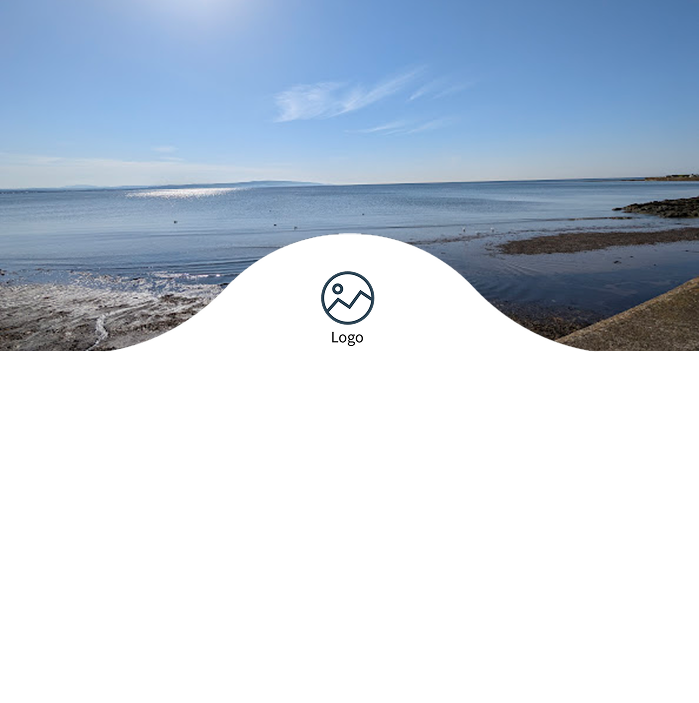
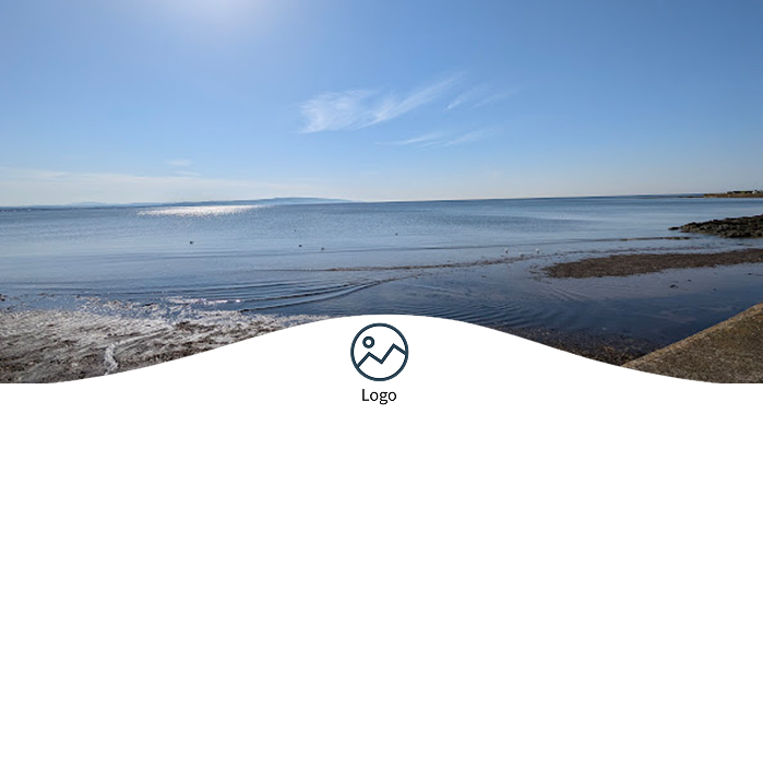
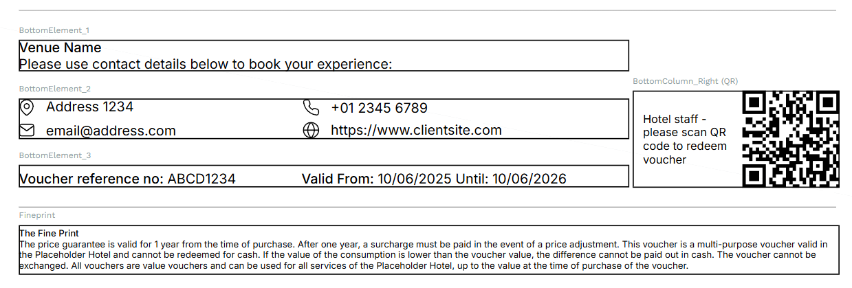
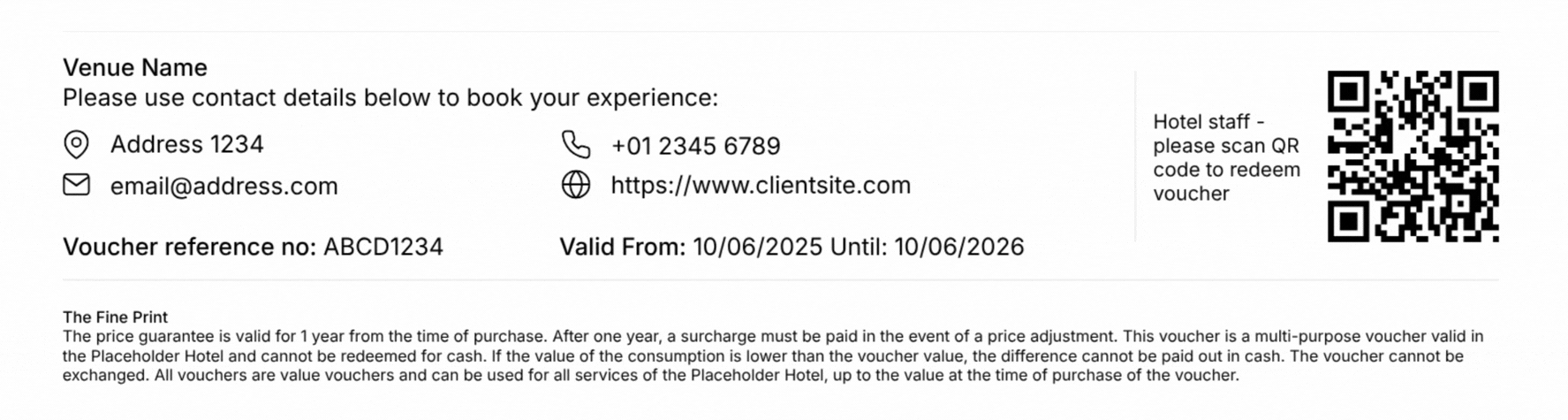
The main decision for this section was how to display the hotel logo. I opted to have the logo field extending above the voucher content into the image field to maximise the available space for text. For clarity and visibility, I placed the logo on a white background. I developed the arc shape to mitigate dead white space, instead having the shape curve down like a ‘tab’.
I tested the proportions of the arc with various logos, as they can range from wide and short, to tall and narrow, and everything in between. I settled on the arc which offered a middle ground, presenting logos of any size with a little breathing room.
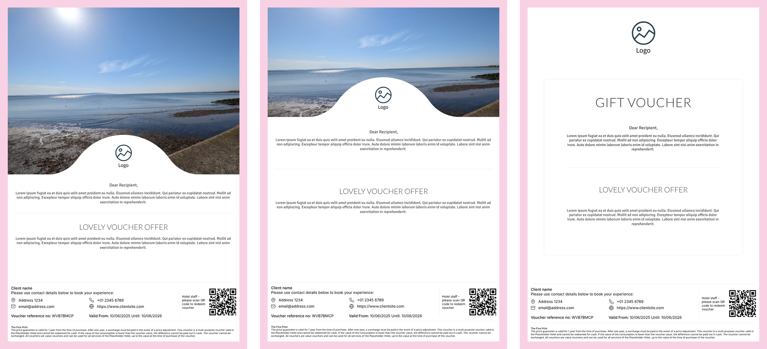
^ The final template designs, ready for applying hotel branding.
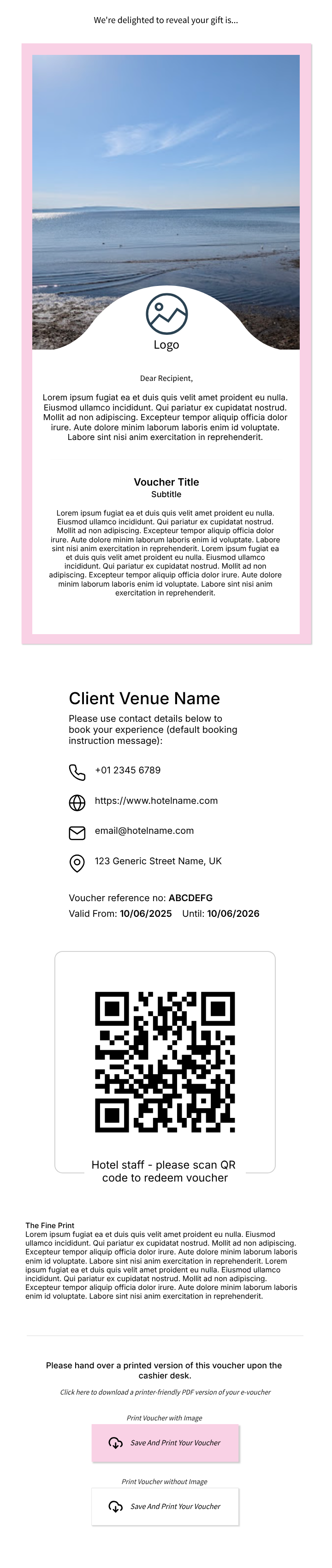
e-voucher
< The old voucher design
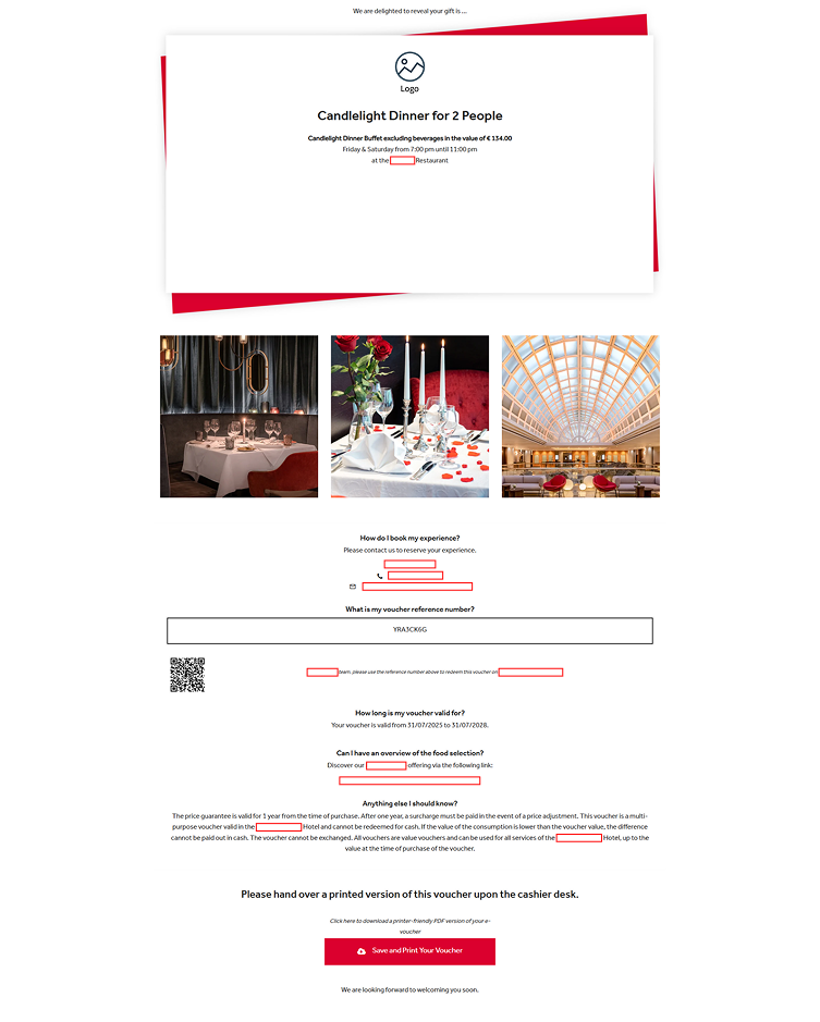
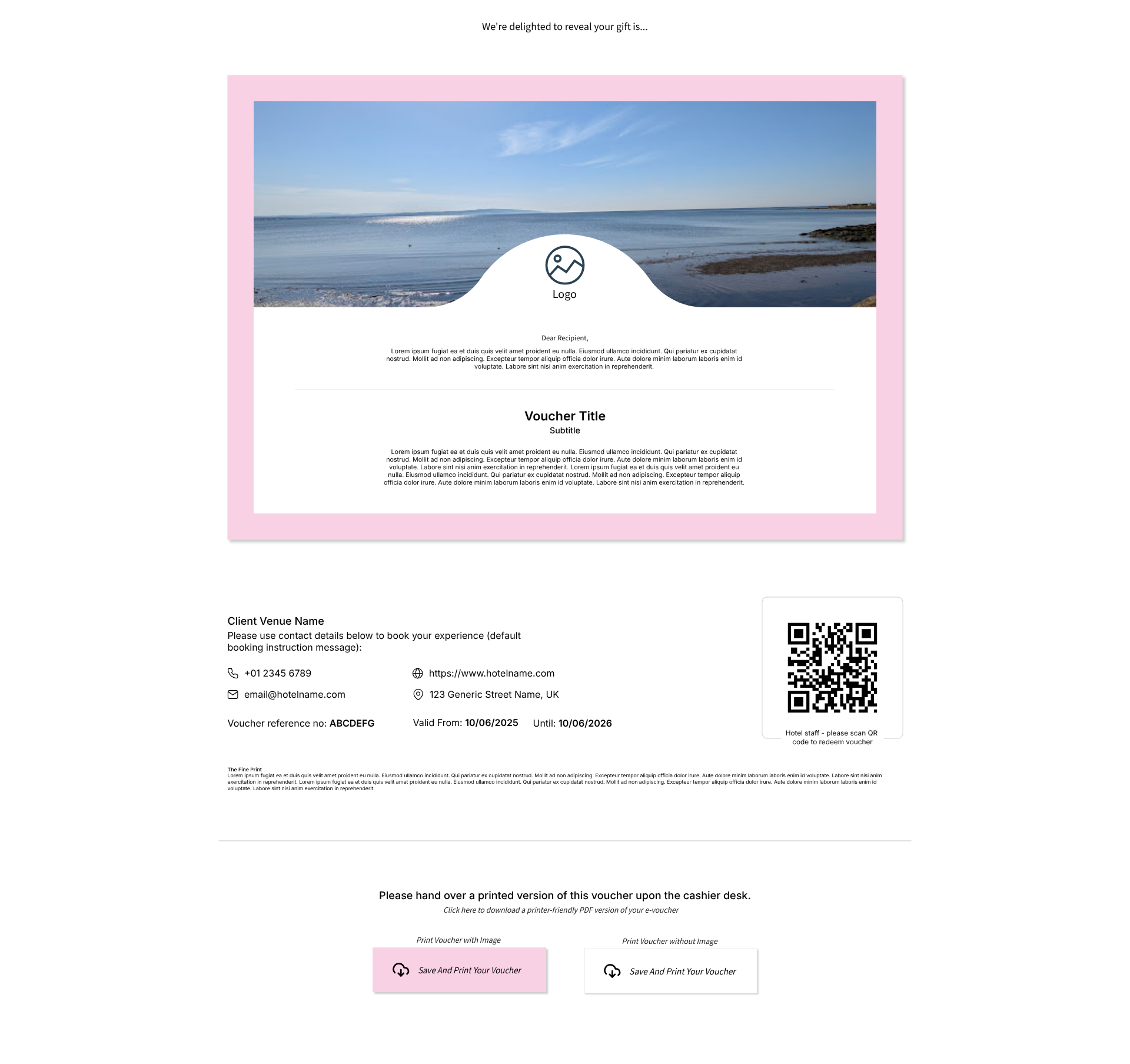
In general, the e-voucher uses the same elements I developed for the printable version, with a few modifications. With the addition of the ‘print’ buttons, the content is almost the same as in the printable voucher. It was requested that I remove the small ‘filler’ images and rework the text area for the voucher details.
The mobile e-voucher is optimised for easy scanning of the QR code when open on a phone. I aimed to give it a more ticket-like feel, while still maintaining consistency with the desktop layout.
Most of the design groundwork carries through from the print voucher design process.
I opted to create a new ‘card element’ with styling consistent with the new printable voucher.
Client hotels have the option to include an image or not, so I created an image-free version accounting for the extra space.
I added an extra ‘download’ button for the ink-saving version, giving the recipient a choice of layout for their voucher.
reflections
This project had many technical restrictions and I’m pleased with my overall solutions, as are SK Chase and their client hotels.
The new designs have incorporated all design and functionality requests:
- a large space for a decorative image
- more visual consistency when accommodating edge cases such as text boxes at their word limit, or large / small number of booking information fields
- ink saving ‘light’ printable version
Out of all the design projects I’ve worked on, this one has the furthest reach - with SK Chase’s customers purchasing, customising, printing and gifting these vouchers every day. I felt a lot of responsibility to ensure a visually pleasing new solution that enhances the gifting experience, while also remaining compatible with SK Chase’s CMS and technical requirements.