development
< These two images are how I started my day:
The unstyled site offered context of the current state of development and laid out some of the necessary copy.
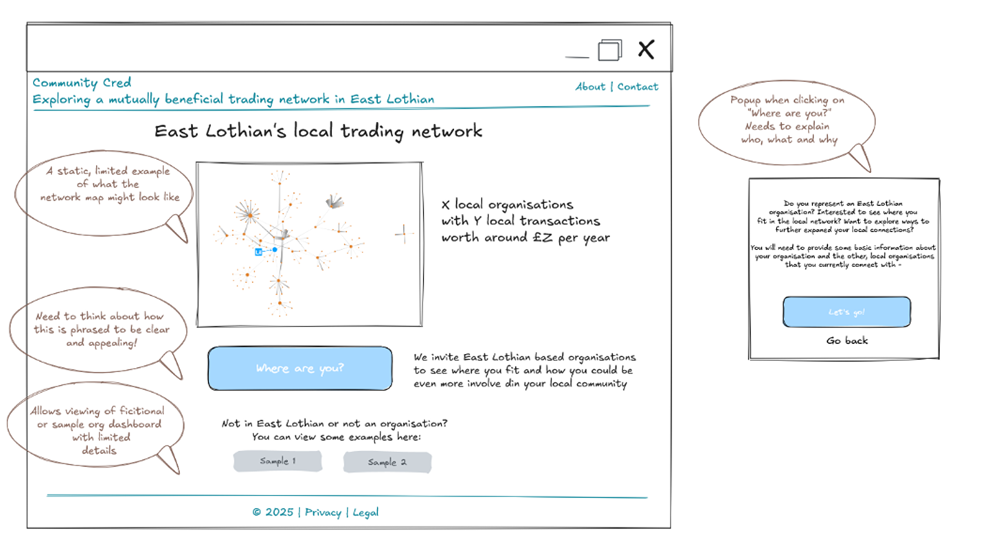
I was provided with a basic wireframe of the home page which gave me an idea of functionality, and I started by creating elements necessary for putting this page together.
My approach to this project was quick implementation, large visual impact. I aimed to use basic visual styling effectively to create an identity that isn’t reliant on custom graphics, or complex development work, incorporating the client request for a hand-drawn feel while keeping the overall aesthetic fit for purpose and target user.
visual elements
I started by looking at CommunityCred’s mission statement:
“By connecting local businesses, social enterprises, charities, and community groups, we aim to strengthen local economies while promoting environmental sustainability and social inclusion.”
From this, I identified some key tonal characteristics to help direct my creative choices:
- Community-focused: friendly, warm, accessible
- For businesses, social enterprises, charities, community groups: trustworthy, clean, professional

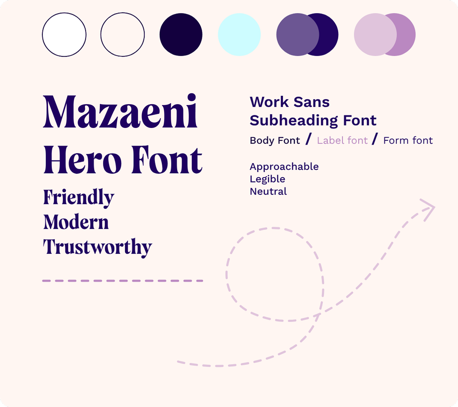
#1e0060: Dark blue is very often used in the financial sector to communicate safety, stability and professionalism. This one leans towards purple - pulling in a little red to warm up the overall feel, adding a sense of playfulness and innovation.

#fff6f2: For secondary use. Pops against warm background and harmonises with the deep blue.

#fff6f2: Used as the background colour. Gentler on the eyes then a plain white background. Intended to elicit a sense of warmth.

Hero/H1: This bold serif typeface offers a sense of joyful simplicity, grounded in elegance. As CommunityCred has no logo at this time, I chose a display font which can hold its own - on the navbar as a typography logo and as a bold, striking H1.
Body/Subheading: Work Sans is a friendly, legible sans serif that looks pleasing at regular and bold weights. I chose this custom body font to add character with minimal visual fatigue. Keeping in mind the client request for a hand-drawn feel, I used this font as a compromise - as it feels soft and welcoming while maintaining a visually clean and professional feel which may be lost with a handwriting font.

To try and bring in some of the ‘hand drawn’ feel, I opted for visible borders around some elements - mixing dashed lines and solid lines for added character, and to help define some visual hierarchy.
As there was no time for custom/complex graphics, I created some simple line art in Penpot to add a touch of movement and visual interest to the homepage. This could provide a basis for a set of similar line graphics in the future.
design

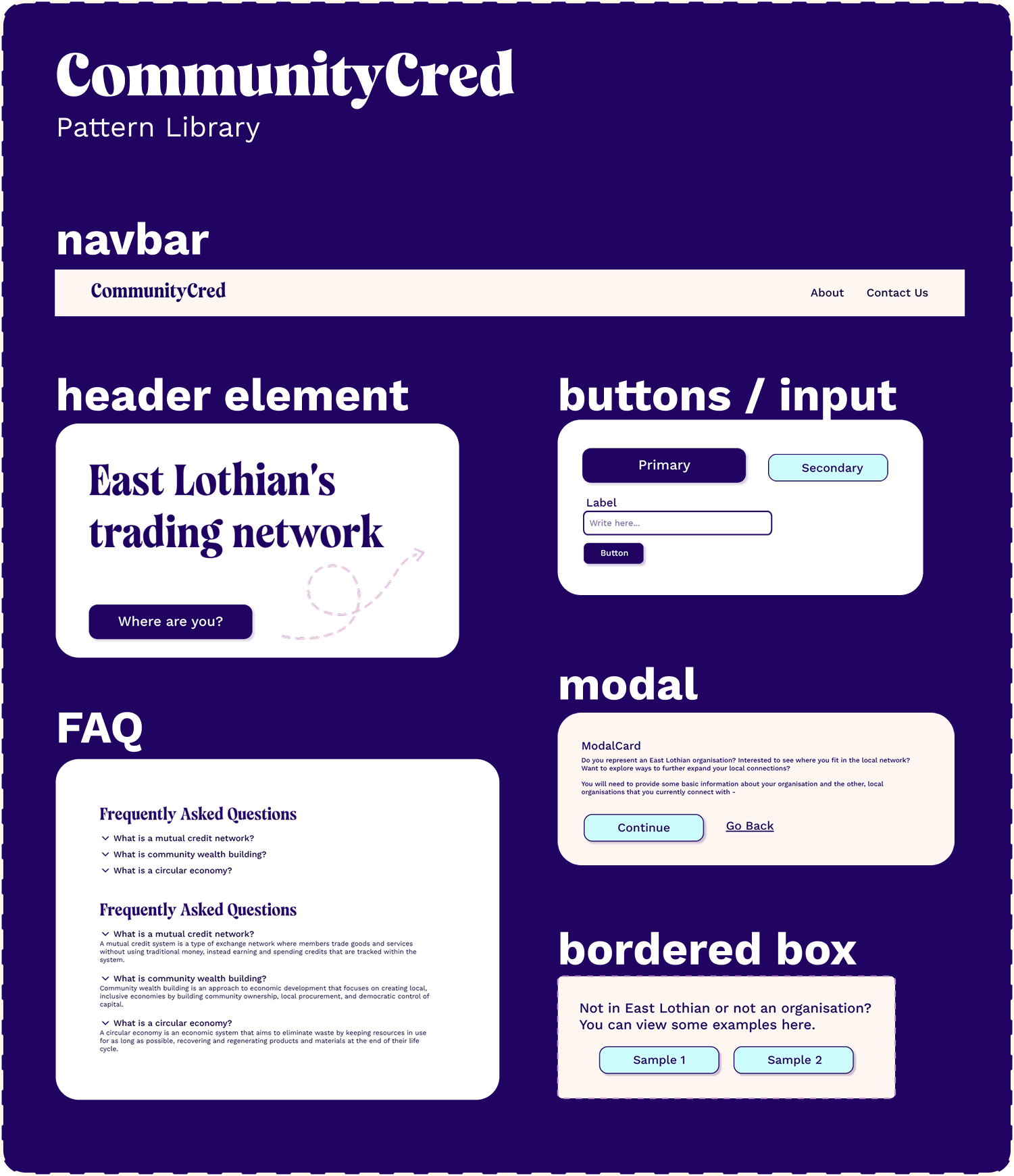
I used PenPot flex layouts to accelerate the transition to code.
I kept the pattern library and designs light and simple, designing only components that would be needed for the site in its current form.
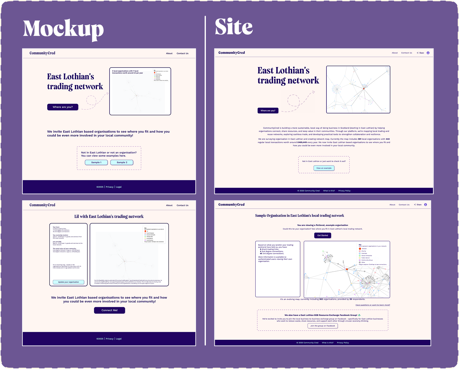
This side-by-side shows how my design was implemented by the dev. I was happy to see that I scoped the design realistically, so that it could be implemented within the allotted time.
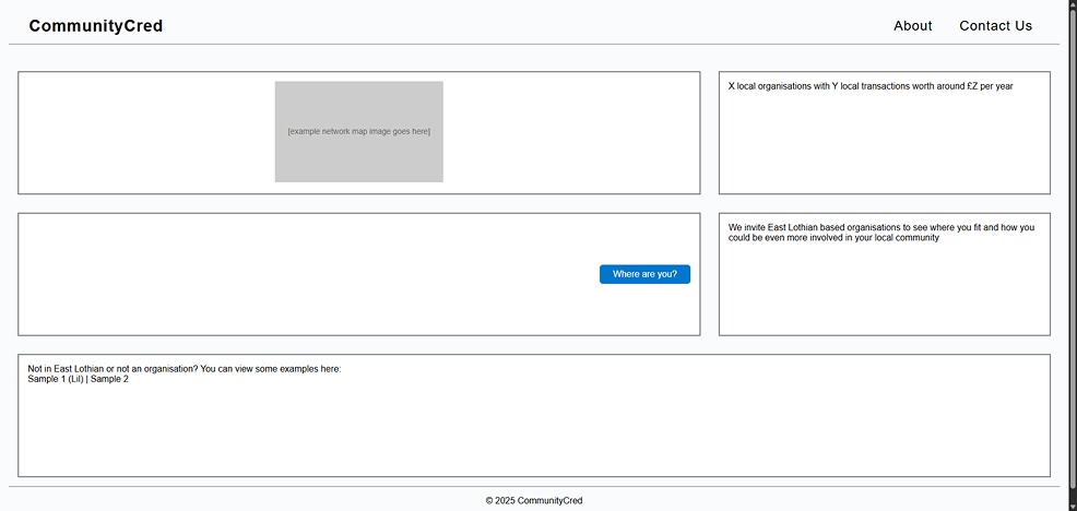
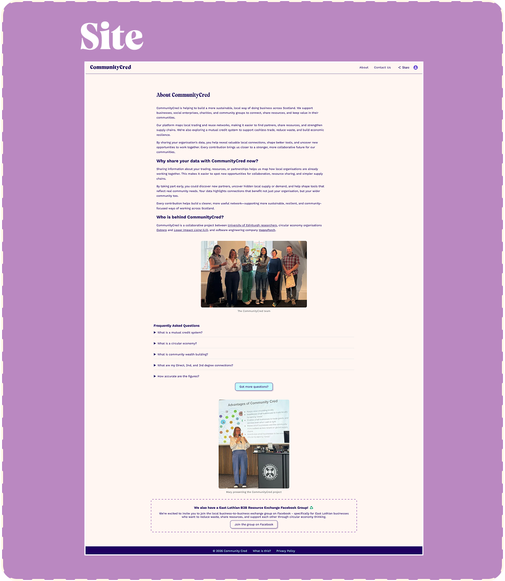
^ This page from the site displays elements from the pattern library being used on a page I didn’t design myself.