2021


These 4 existing illustrations created for HappyPorch by Donna Neely were the starting point of my designs. My aim was to maintain this general style while branching out in imagery, expanding the collection of graphics but keeping this distinctive, playful line-drawing style.

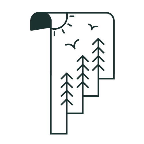
I created these two illustrations in Photoshop as I didn’t have access to Illustrator at the time. This presented significant challenges in creating clean and consistent shapes and managing resolution, as they were not created as vectors, but as pixel-based images. I was very inexperienced in creating graphics in this style when starting this project - it was a steep learning curve!

Takeaways
- Upgrading to Adobe Illustrator was an immediate priority to access more suitable tools and an industry-standard workflow.
- My interpretation of the style was positively received, and I got the go-ahead to be a bit experimental and playful with the imagery for future illustrations.
- I aimed to improve line consistency and balance (which would be enabled by switching to a vector-based workflow).
- The dark block looks visually inconsistent - going forward I would be more mindful of this and either give all designs in a set a proportional block shape, or none of them.
2022

These three illustrations were created for specific sections within the HappyPorch website:
- Fractional CTO Expertise
- Digital Product Development
- Empowering your Rental Business


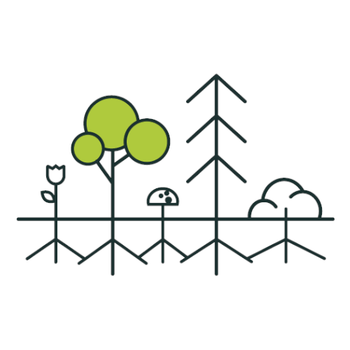
In this instance, the imagery relates to the section they illustrate. We decided to lean into more nature & human-centric imagery going forward, and these served as proof-of-concept for that direction.
Takeaways
- There are some issues with micro white space, especially in the map. With a few tweaks, these designs could be improved by giving elements a bit more room to breathe, which would achieve a cleaner and more visually balanced end result.
- The map illustration makes a great background graphic when the opacity is lowered. This opens up some fun use cases for the simpler illustrations.
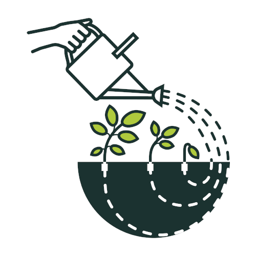
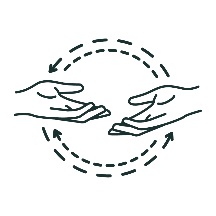
2023


I designed this set of illustrations for HappyPorch’s 2022 annual Impact Report. My aim was to explore the single line style further, and I got the go-ahead to be a bit experimental.
The pop of colour was an additional request, and I selected this bright, light green to convey growth and positivity - in addition to it contrasting nicely with the HappyPorch orange. This set was designed to illustrate concepts relating to specific section headers:
- Charity
- Circular Economy
- Climate
- Diversity
- ProBono
- Team Culture


Takeaways
- I gained confidence with Illustrator and explored some more technically challenging ideas that I believe were quite visually successful.
- The balance of white space was implemented much more successfully this time. Increasing the complexity of illustrations pushed me to minimise visual clutter to offset the intentional busyness of some of the illustrations.
- The line thickness is still a bit inconsistent due to the difference in complexity between the graphics. This is something I paid much more attention to in the next set of images.
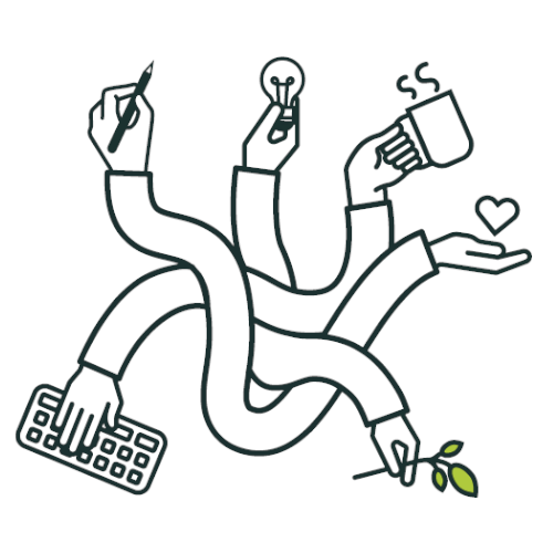
- The ‘busy hands’ illustration is a bit more complex than the others, causing it to feel disconnected from the rest. However, I was keen to try out this idea, and it ended up inspiring a later set of illustrations.
- The feedback on this direction was very positive, giving me the confidence to push myself and refine my interpretation of the style.
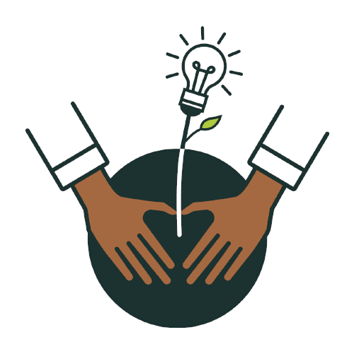
2024
This set of illustrations was created for HappyPorch’s 2023 impact report. I was essentially left to my own devices with the brief for these, so I chose ‘busy hands’ as the guiding concept - inspired by this illustration from the previous year’s set.

The two main visual elements for this set were hands and block shapes (inspired by my very first negative space illustration from 2021).
I aimed to evoke a sense of taking action - technically, environmentally and socially to illustrate the team’s commitment to our BCorp recertification.
I also got the go ahead to add some additional skin tones, as these illustrations are transparent and displayed on a white background and I wanted to better reflect the diversity within our ‘busy hands’.
Each illustration is built around a basic geometric shape.

Takeaways
- I wanted to push myself a bit with the negative space, and had to iterate a lot to come to the versions here. Balancing the light and dark elements and ensuring they didn’t look too busy or complicated took some time, and the micro whitespace within the illustrations took a lot of refinement.
- This set of graphics have a relatively consistent (heavier) visual weight through the incorporation of the dark block shapes. They really feel like a ‘set’, and I think they complement each other well.
- Although they’re not perfect, these demonstrate clear development of my technical skills as I take on increasingly demanding design ideas. I strive to continue improving as I expand the HappyPorch graphics library.
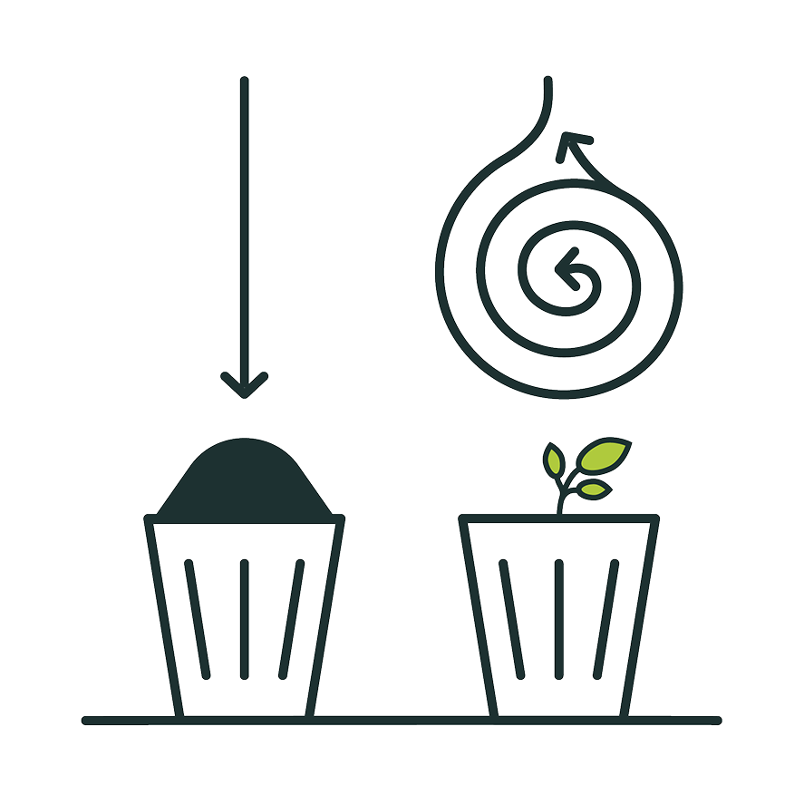
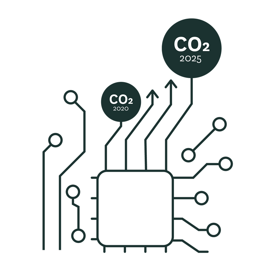
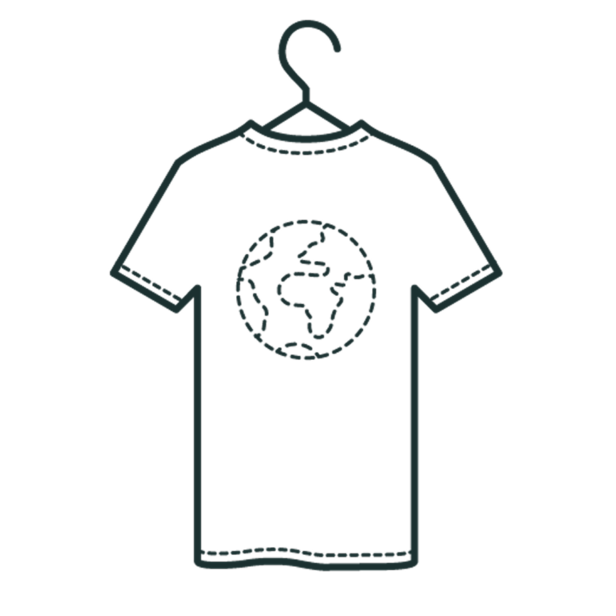
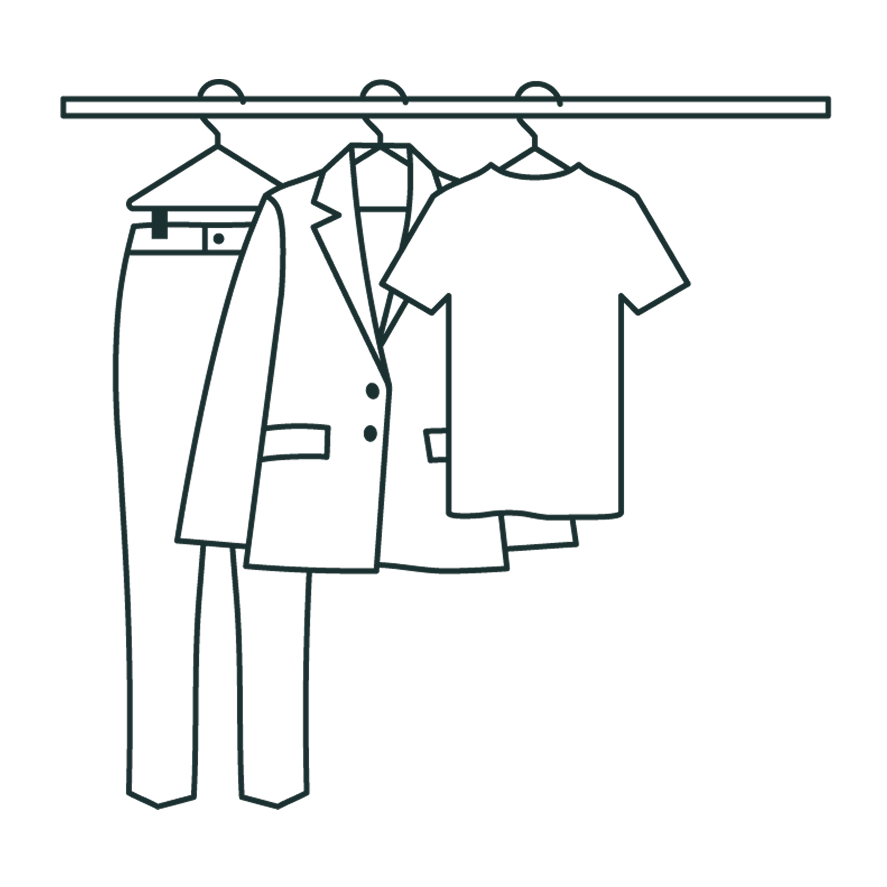
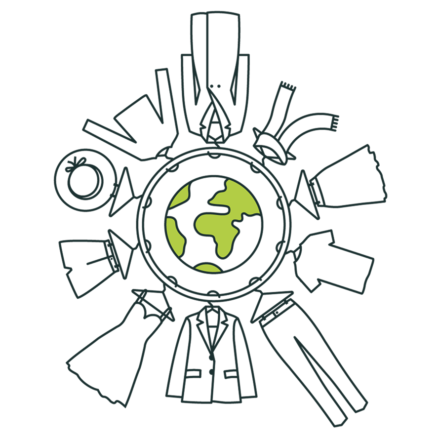
miscellaneous

These graphics were created for various uses across HappyPorch marketing materials. Some lack context on their own, but each illustrates a different concept or was designed for a specific design purpose in mind.


Takeaways
- The line weight of these appear inconsistent as some are designed to be displayed at a larger scale than others.
- This selection displays different applications of the single line style; some use organic shapes and lots of curves, and others more sharp and technical. I try to keep the expression of different items the same across all my illustrations for consistency, which I think I do relatively successfully. There are cases where I change this (such as the t-shirts) to maintain detail consistency within specific graphics, especially when both won’t appear next to each other.
- I think the 1st illustration portraying linear vs circular economy is particularly strong, and a solid alternative to a basic ‘recycle bin’ concept.