development
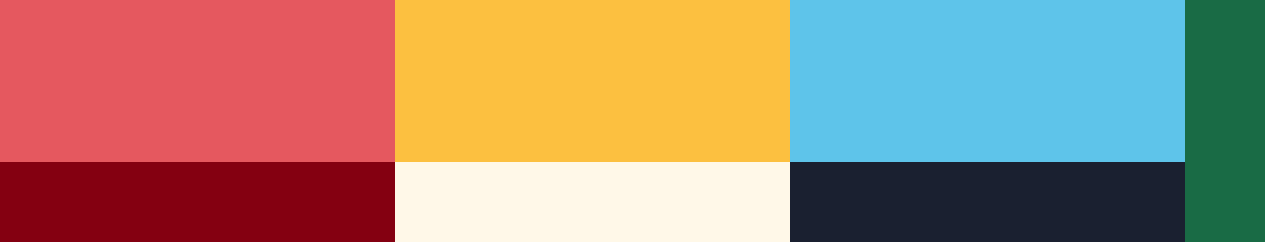
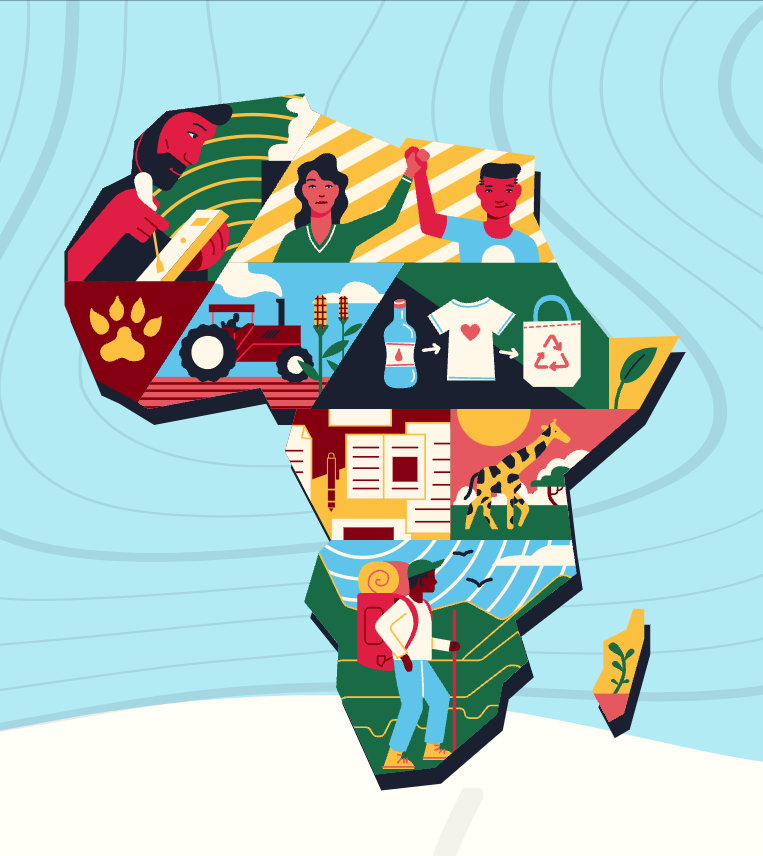
I created the colour palette by using the same colours as in the this header image for the page, made by MUTI design studio (left).
This image was the driving inspiration for the site’s styling, so I also used the shape language of MUTI’s illustration to inform the style of my own designs.
These two drafts experiment with the colour scheme and motifs. They’re a bit rough around the edges, but helped to define my approach to the rest of the illustrations

illustrations
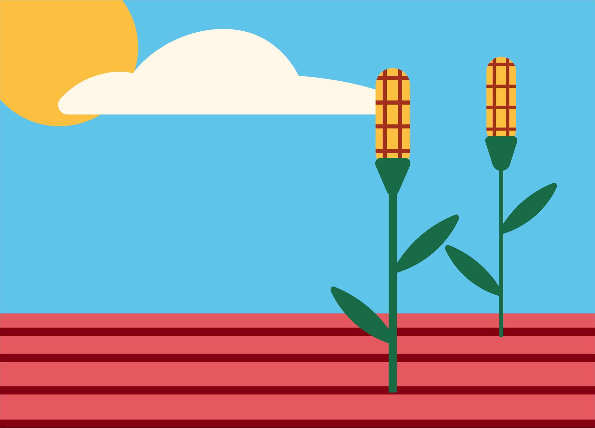
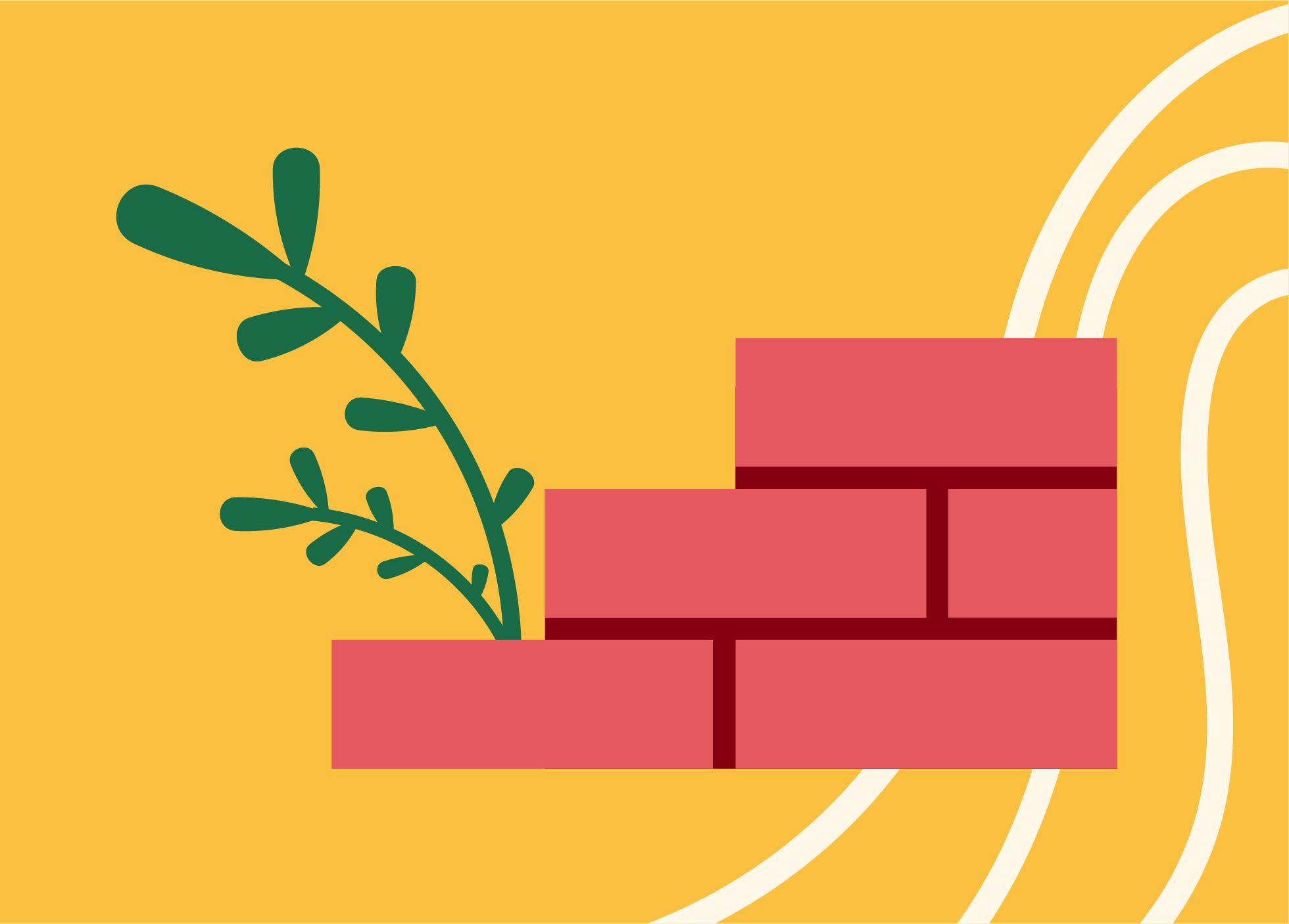
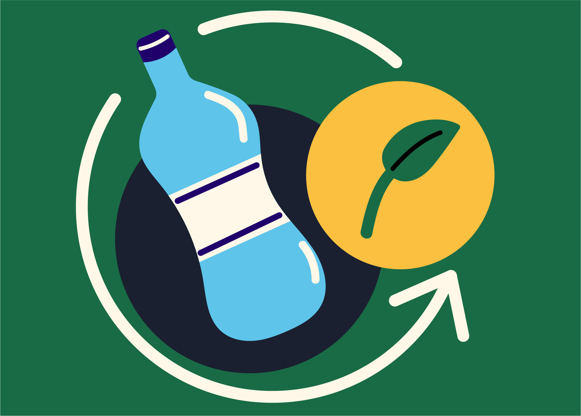
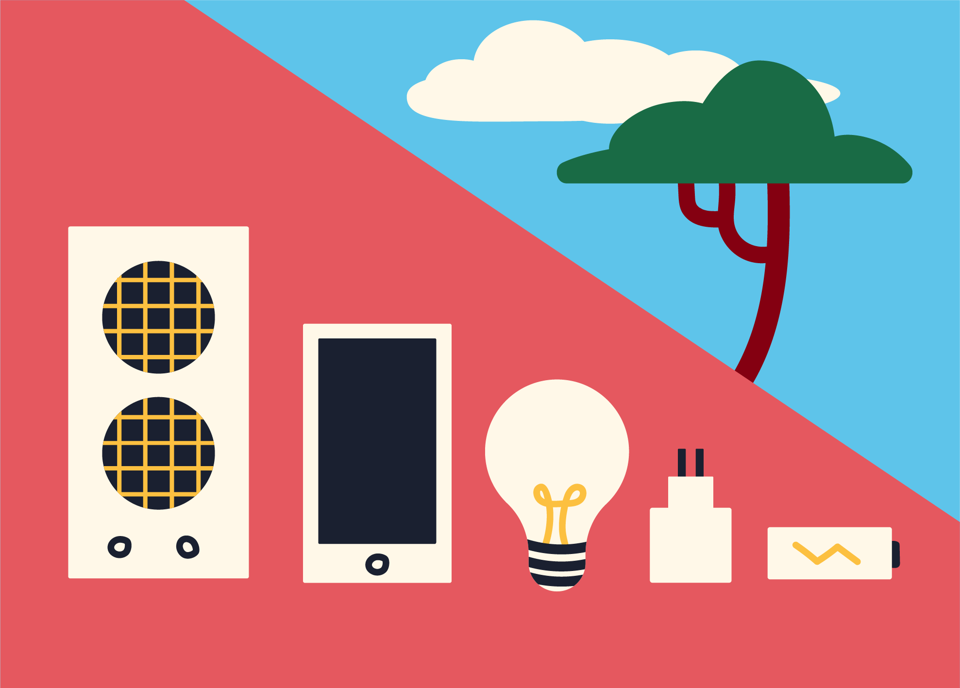
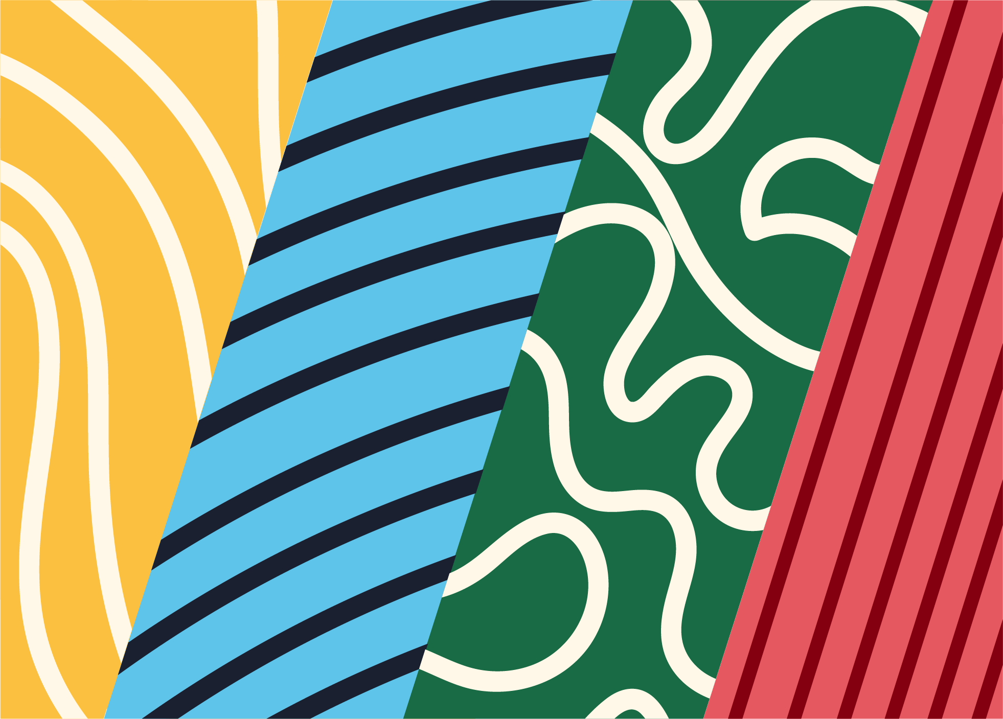
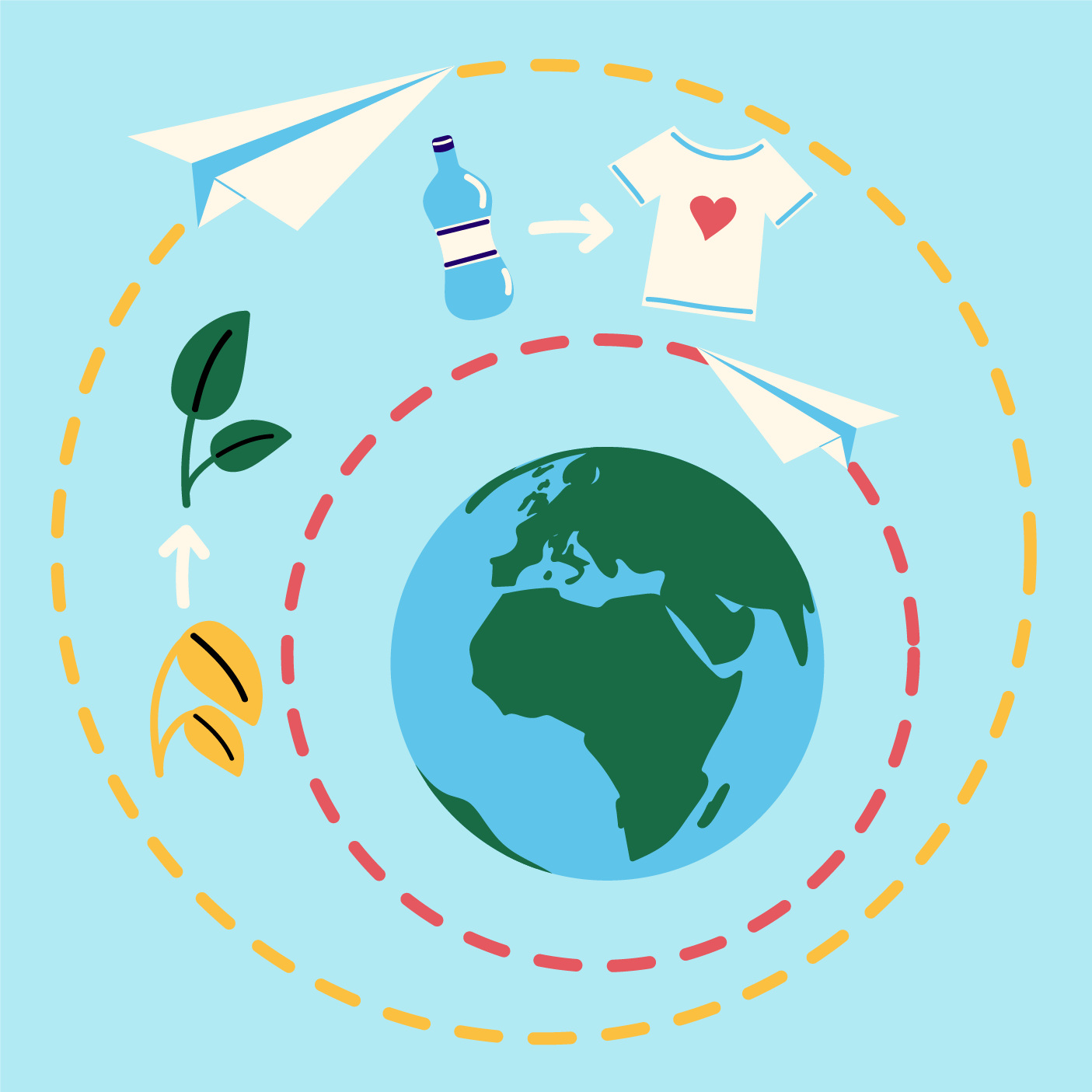
Colour
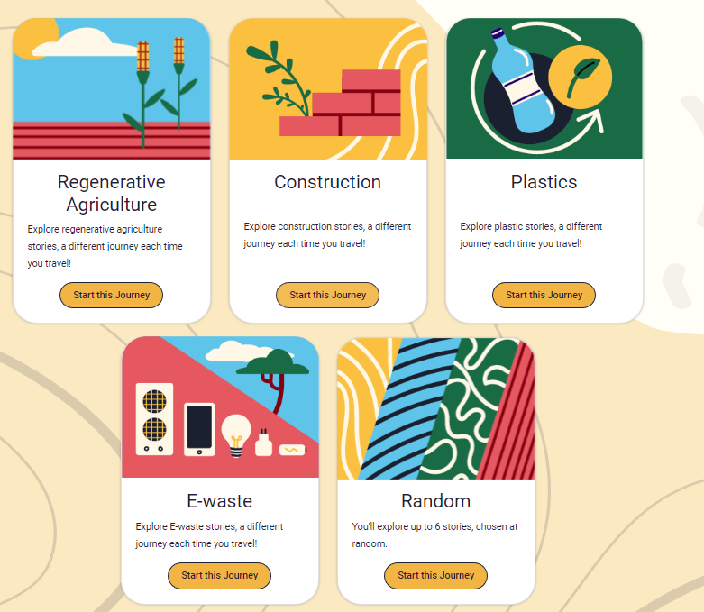
Each image features one main colour from the palette to offer a distinctive look.
Line
I use lines to create movement and visual consistency.
< This mockup shows the graphics contextually as they were displayed on the website.
reflections
I haven’t worked in a style like this before, but I enjoyed the challenge of creating motifs in this almost cut-paper, flat expressive style.
I feel that the ‘e-waste’ illustration is the weakest as it doesn’t follow the colour & line expressions of the others as effectively. The red doesn’t feel predominant, there isn’t any linework in the background as there is in the others. I’d also remove the dark blue accents from the tech, as I feel as it uses too many colours compared to the others. This one could probably use a rework, but overall I feel that they look good together and nicely fit their brief and purpose.
A tight colour palette and expression of complex ideas through simple shapes is always a great exercise in restraint and intentionality. It definitely gave me an appetite to create and play with bold colour schemes and experiment with visual styles I’d usually not gravitate towards.