concept
My first ‘proof of principle’ sketch looked more like a sunset, but I was keen to incorporate the warm orange-yellows to reference the logo colour.
My concept was to seamlessly incorporate the header image into the rest of the page. I liked the idea of the whole page being ‘bathed in sunlight’ so I experimented with full-page gradients that would gradually shift as the user scrolled down.
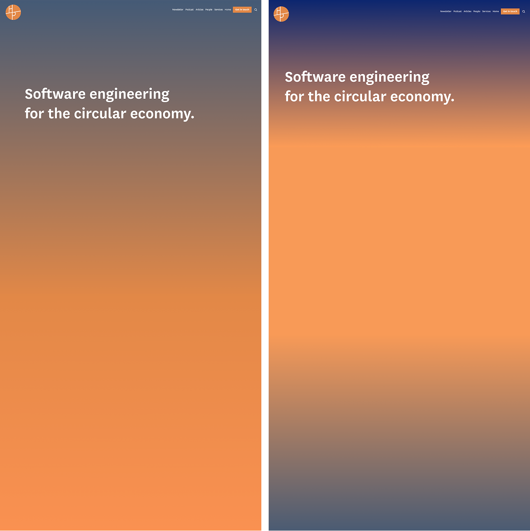
I was unhappy with the gradient based on my first sketch, so I tried out some different gradient colours. I found the warm orange very effective as a background colour so I decided to incorporate this into the development process of the header images.
I tested a gradient footer too, but it didn’t look as good as I had hoped to keep the site’s current dark green, and the gradient from orange to green got very muddy.

sunrises
My focus was shifting the colour expression of my designs towards sunrise, instead of sunset.
I started by looking at pictures of UK sunrises. My first iterations focused on capturing the visual characteristics of a sunrise.
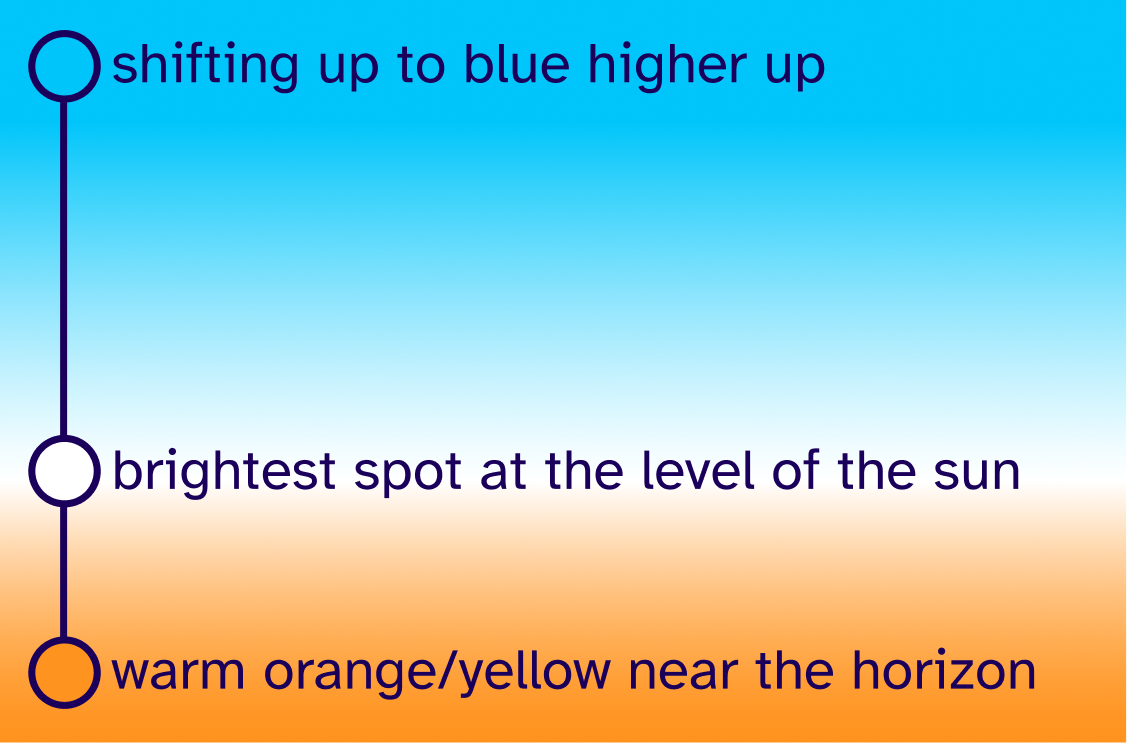
I wanted to create a colour scheme to invoke a sense of hope and optimism.
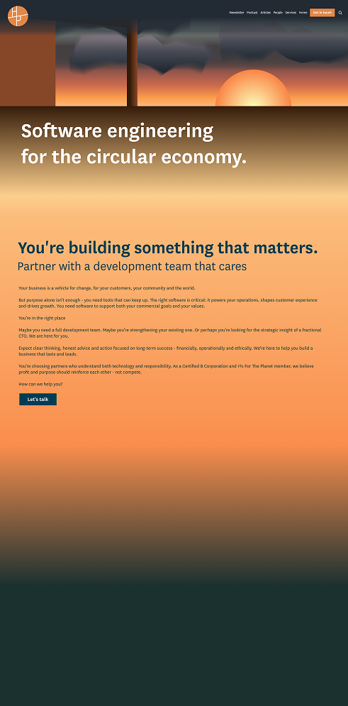
This first version focused on soft gradients. I ensured the orange was the bottom colour to flow seamlessly into the body gradient.
I experimented with a non-gradient version, for a cleaner feel.
According to feedback, the solid version was preferred, so I went forward with this ‘cut paper’ look.
colour & movement
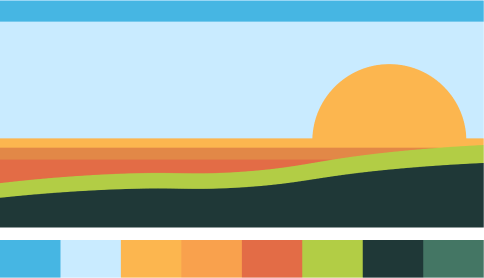
I added some land to break up the horizontal lines and create some movement. I used the existing HappyPorch greens for this.
I created many iterations with different colour combinations to get a feel for how they affected the overall atmosphere.
I opted for a warmer sun, as the initial off-white version felt very intense and was a large white block shape on the page which felt very visually heavy.
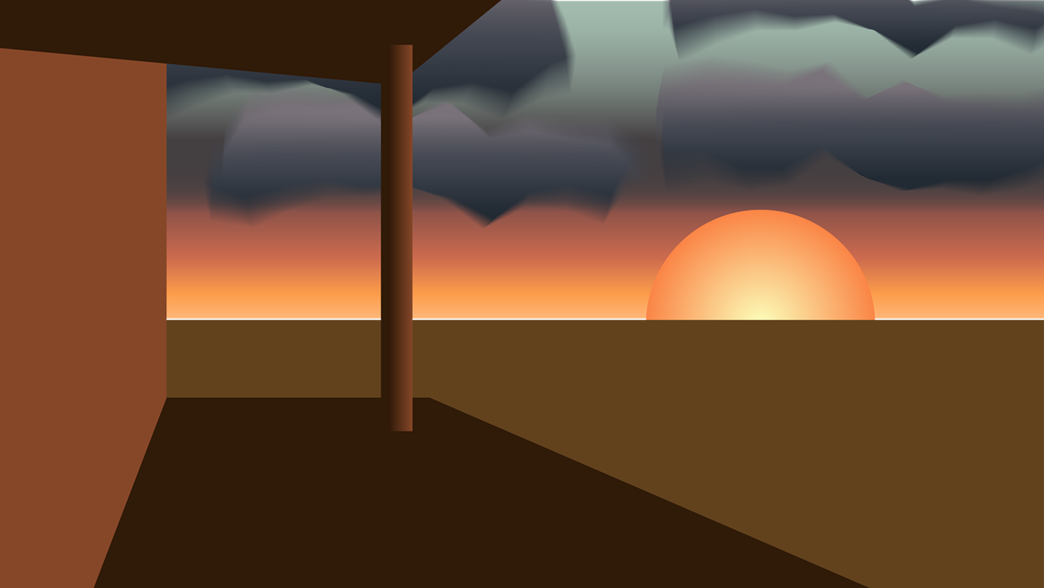
I tried adding the silhouette of a literal porch. I found that it left little space for headings, and feedback leaned towards focusing on the view, so I scrapped the idea.
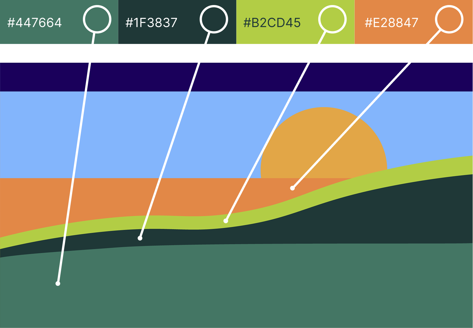
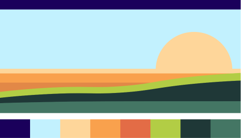
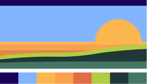
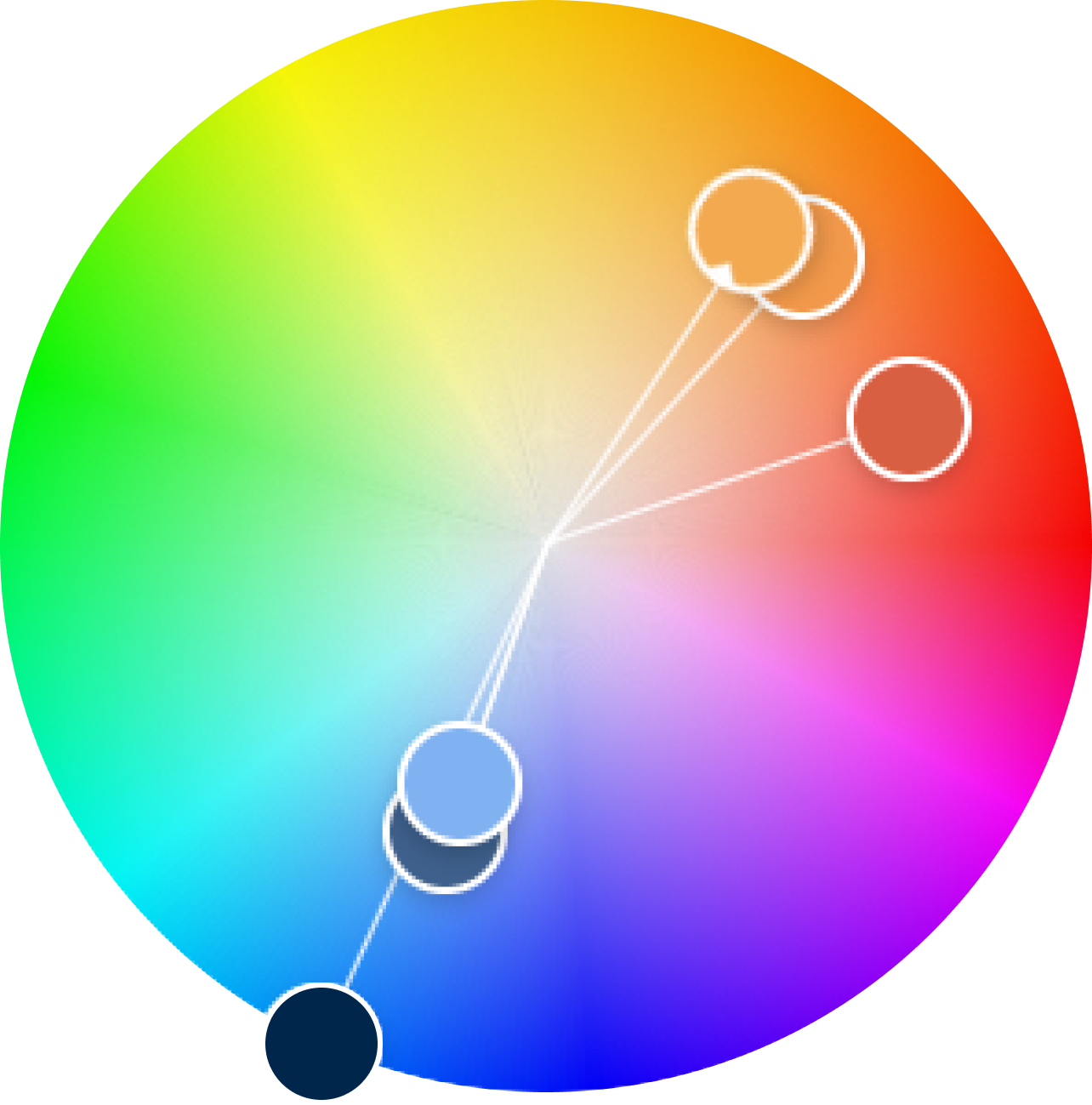
As the existing HappyPorch palette has quite a few sunrise-like colours, I attempted to stick to these initially. I quickly found there was no way around selecting some blue shades.
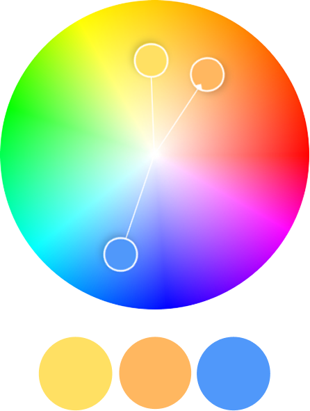
I did some experimentation in Adobe colour. Yellow, orange and blue stuck out as a nice split complementary.
I moved away from the green as it clashed with the aim for the orange colour to flow directly into the gradient. My next iteration focused on adding movement without using green at the bottom of the image.
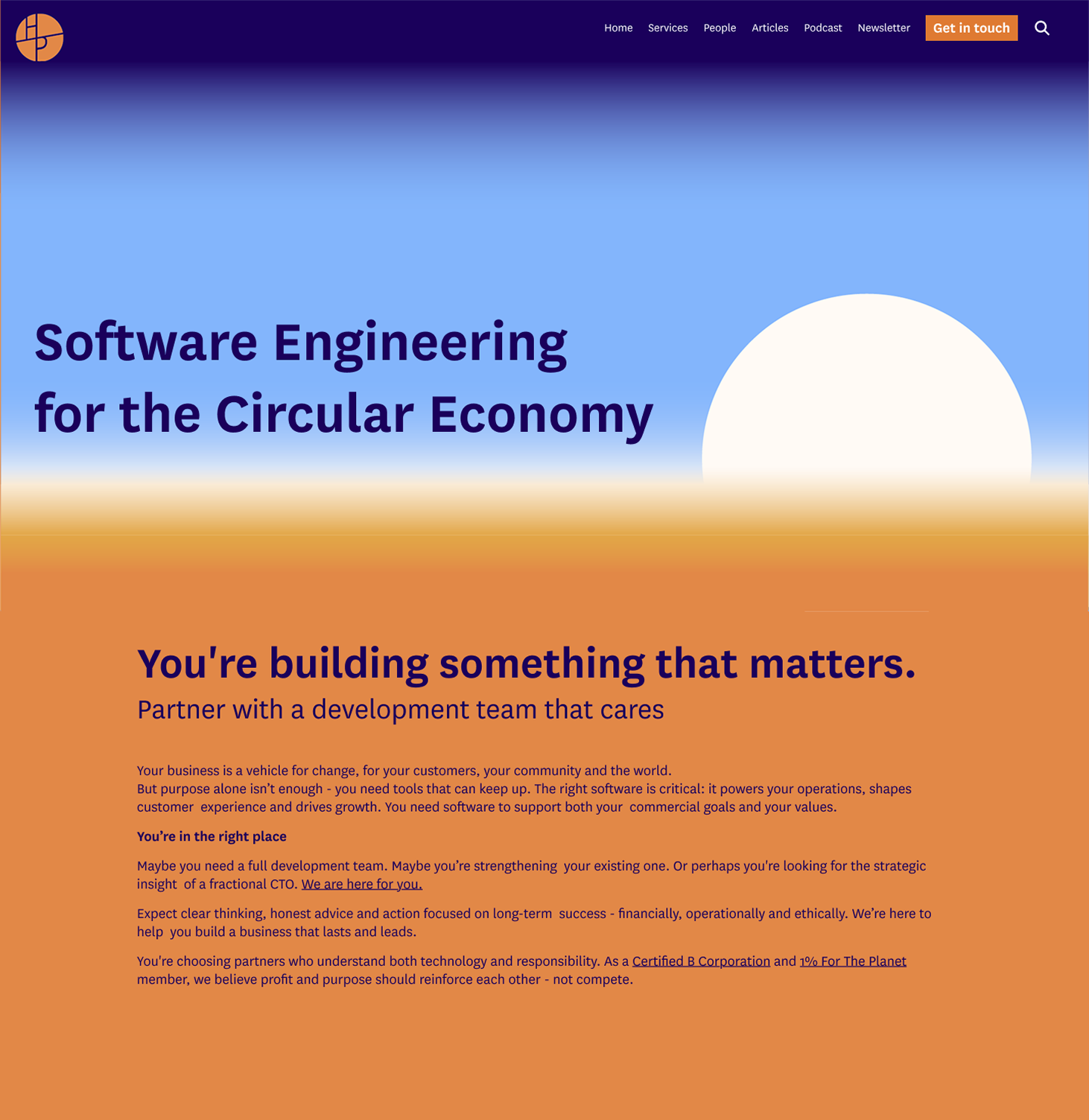
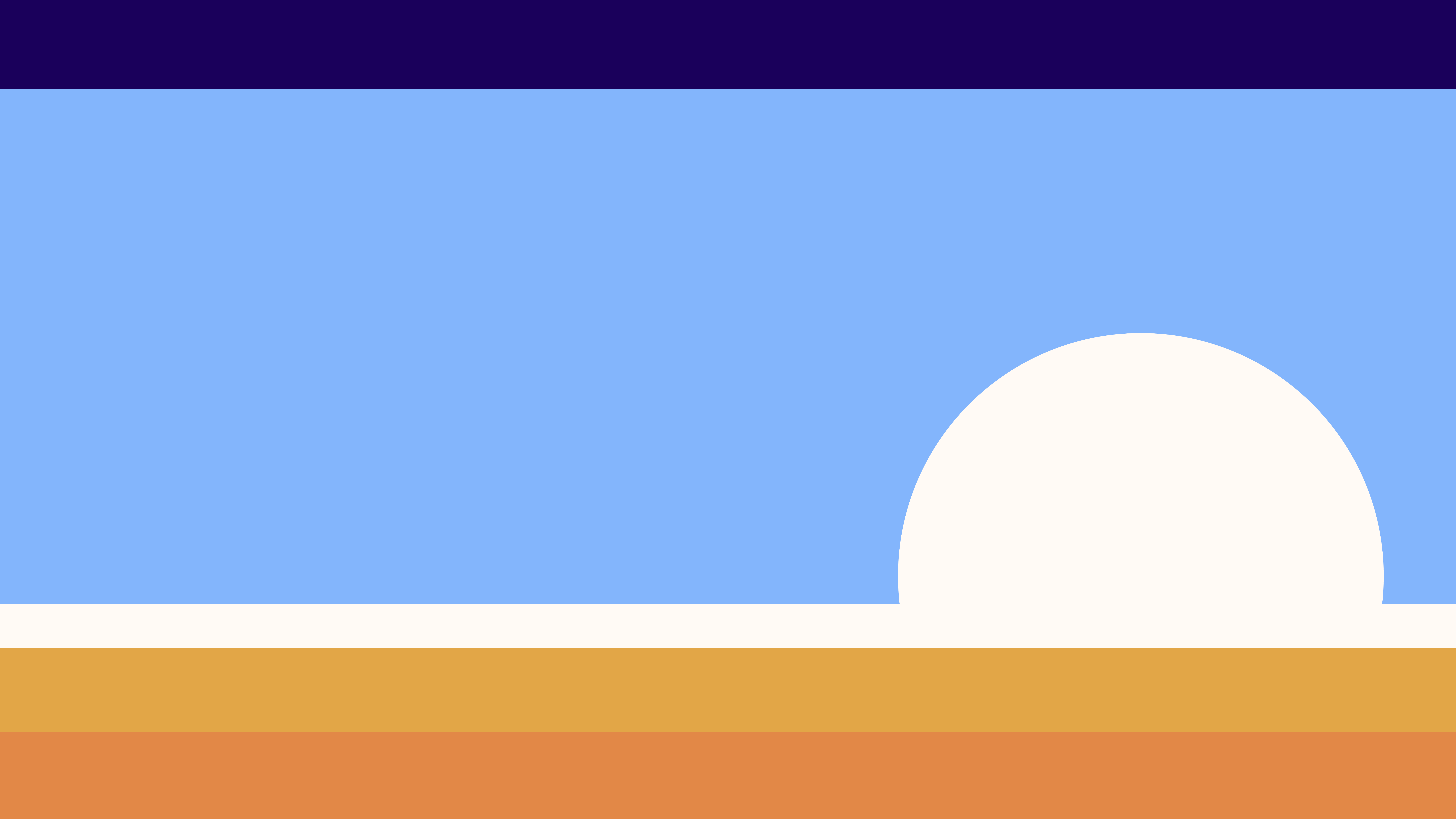
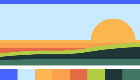
This version formed the basis for the final illustration. I developed the grass waves into flowing, abstract sun rays and refined my colours, opting for slightly muted but still bright, happy tints.
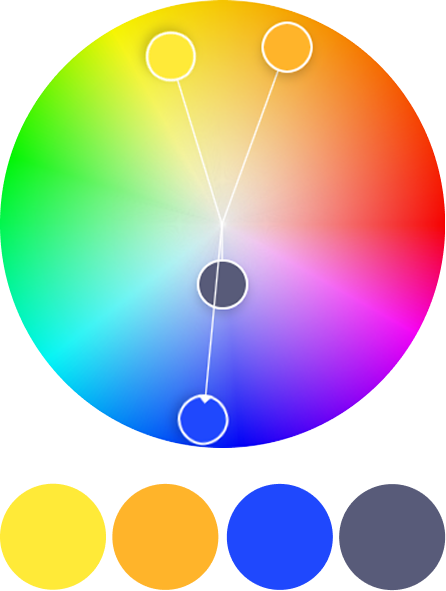
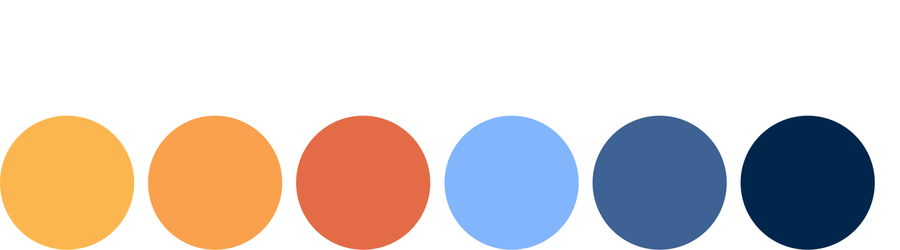
I used Adobe Colour and my previous iterations to select these final colours. I used the deepest orange as the anchor, selecting an analogous yellow and light orange. I liked a light blue from my colour experiments and used a variation of a split complementary palette to get the grey-blue and deep blue.

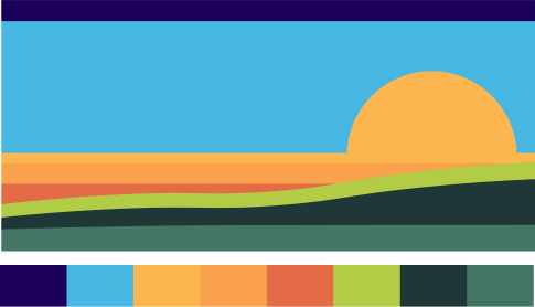
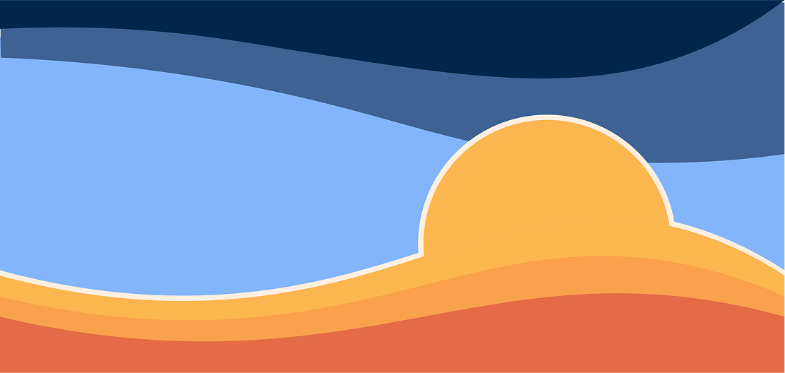
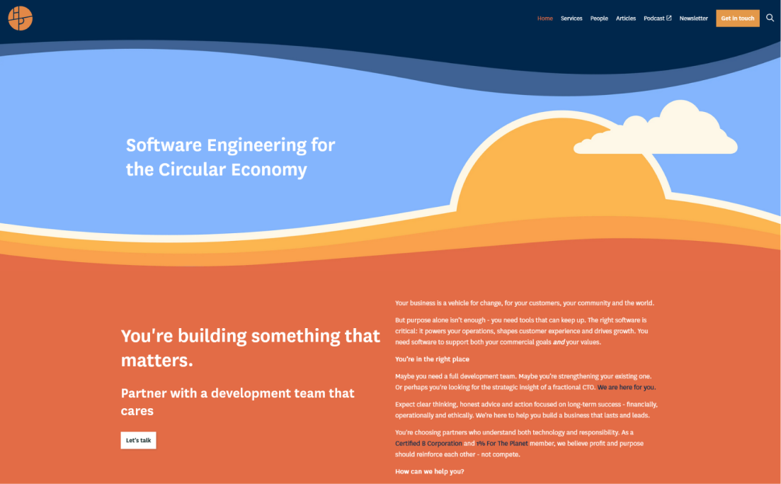
An optimistic sunrise for the homepage. The simple, welcoming image speaks to HappyPorch’s friendly approach paired with skill and realism.
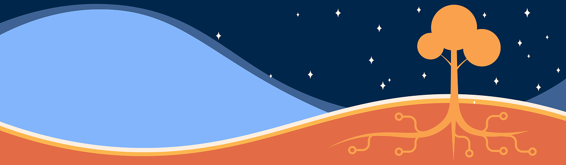
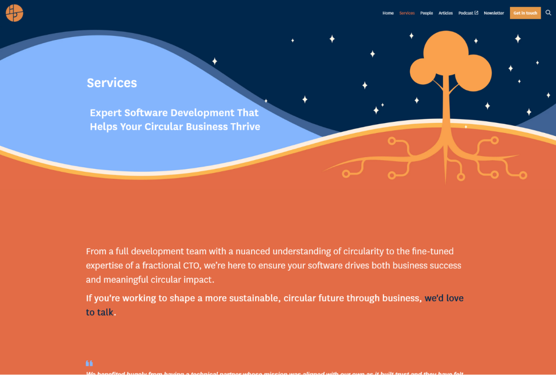
An intersection of digital & natural imagery for the Services page highlighting technical prowess for environmental good.
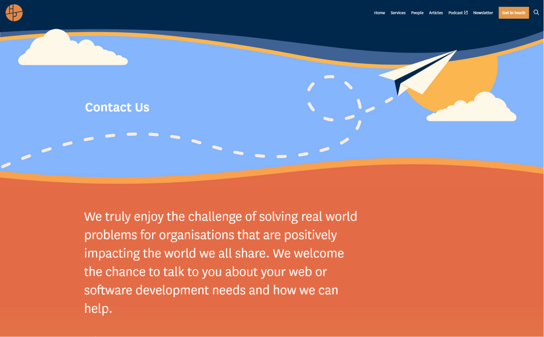
I went for a playful paper plane motif for the ‘Contact’ page - by reaching out to the team the user is embarking on a kind of adventure.

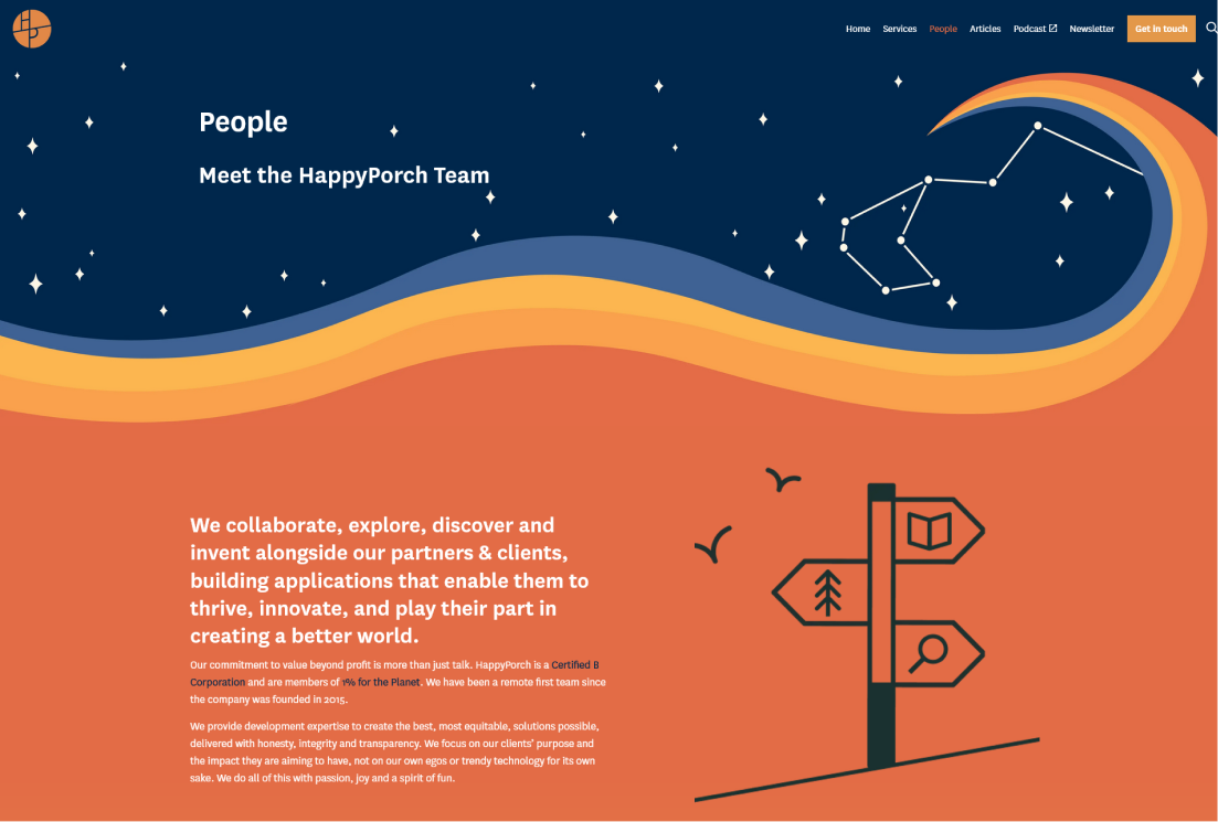
The 8-pointed constellation featured on the Services page represents our 8 team members - shining brightly both as individuals and as a team.

development
(in progress!)
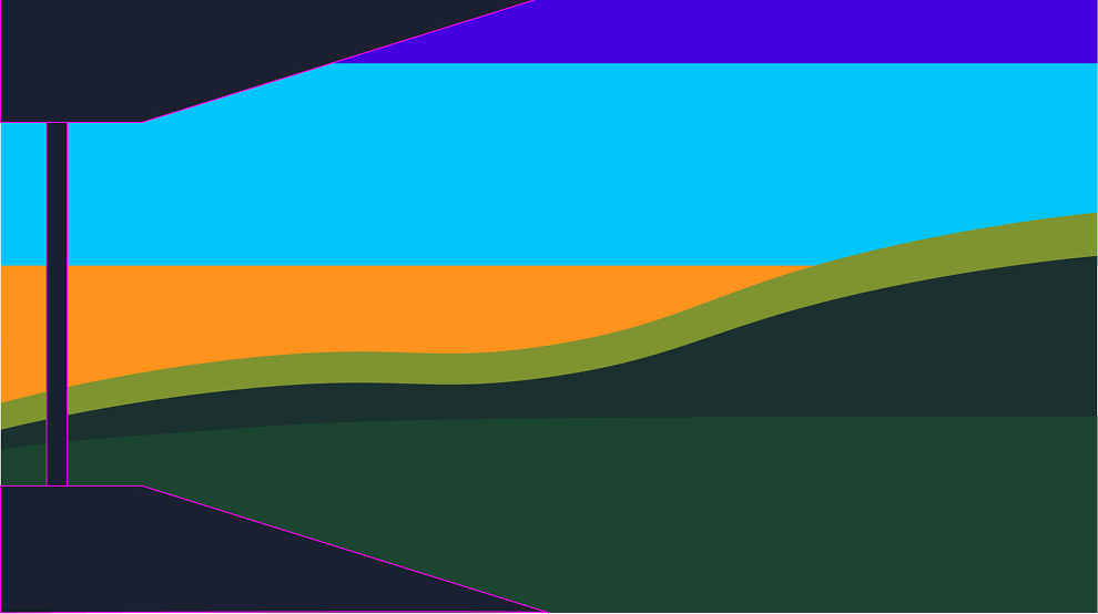
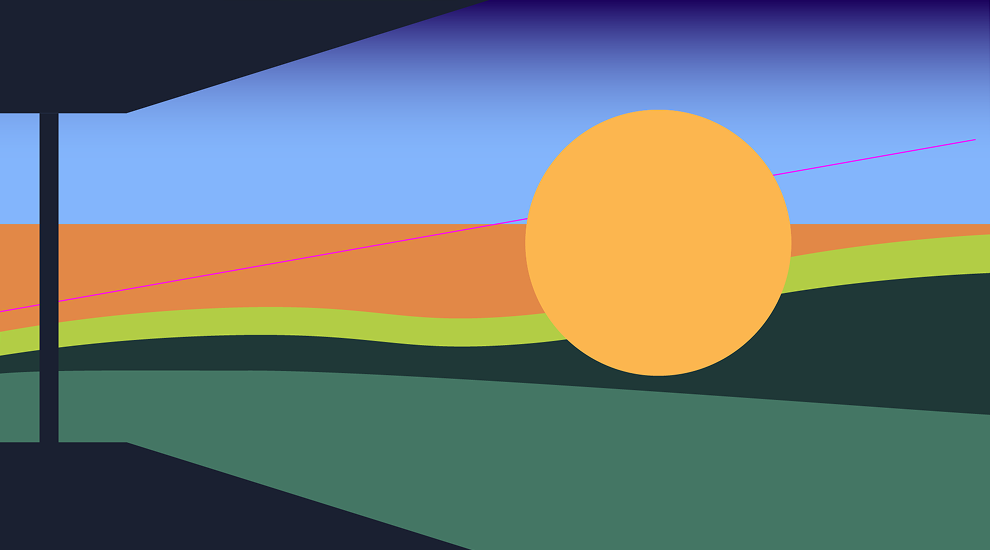
As well as designing it, I’m also implementing the update in Umbraco uSkinned. This is still a work in progress!
Some custom CSS overrides are needed to apply some of the more artistic effects such as the gradient and working on this alone is a fun challenge.
I use the same dark blue for the navigation bar as I do for the top of each illustration, creating the illusion of the two blending seamlessly.
take a look at happyporch.com
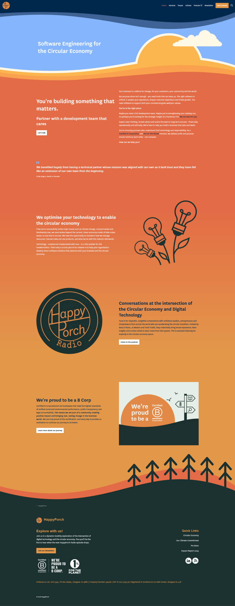
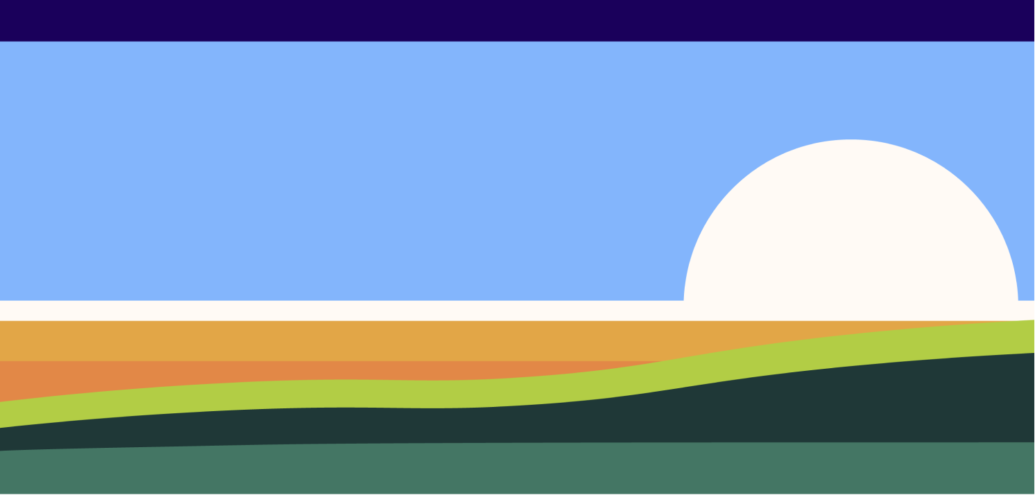
Aside from a content update which is pending, there is also a footer graphic to be implemented. This was my alternative to the initial gradient ideas. Instead, I created a hill graphic, containing the content between land and sky instead of condensing both into the banner image itself.
The new look also took the site’s score on WebSiteCarbon from a B to an A! :)